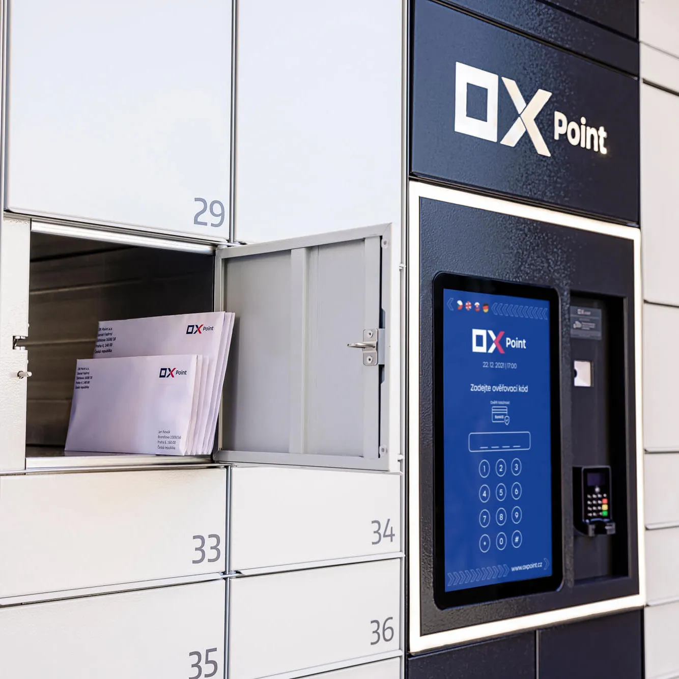
OX Point is an open delivery network that is the only one to manufacture its boxes in the Czech Republic.
As the new brand needed to cover the entire spectrum of marketing communication (from strategy to social media to PR), we worked with all the agencies in our Near & Dear group on the project.
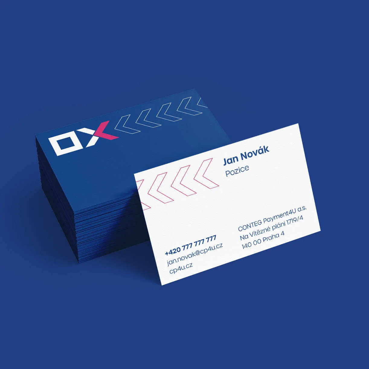
Among other things, the new brand strategy removed a redundant dot from the original name and added the tagline: “Last mile has never been shorter”.
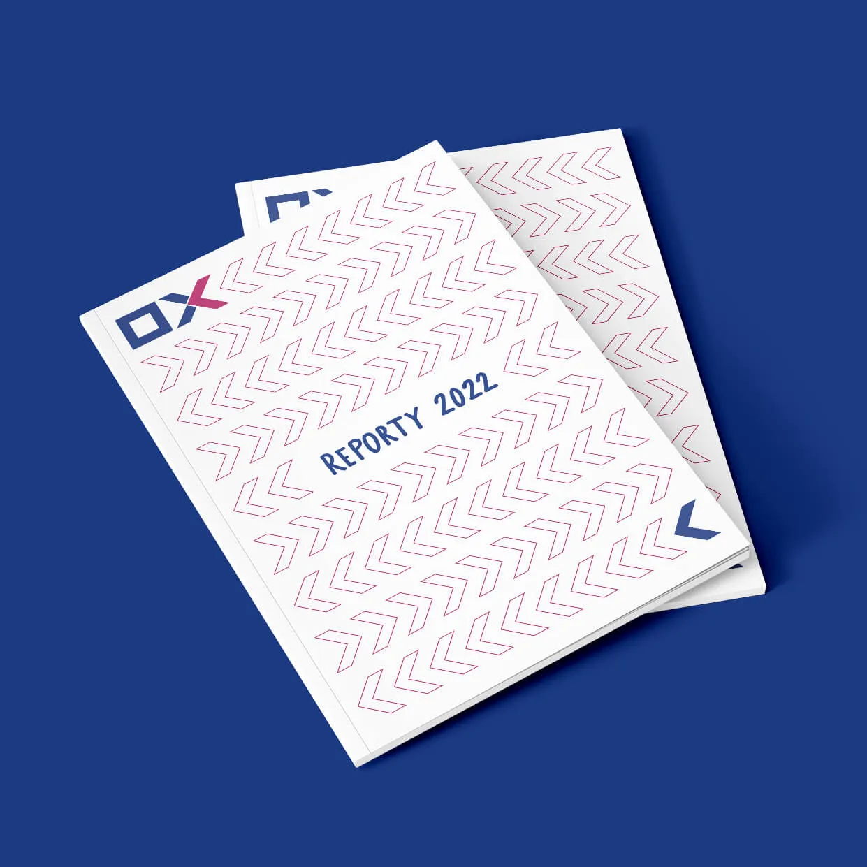
The visual identity was interwoven with the Urbane font and enriched with patterns based on the arrow motif in individual outputs. We split the OX symbol to emphasize the arrow without having to include a color transition (which was a major stumbling block in the logo the brand had previously used).
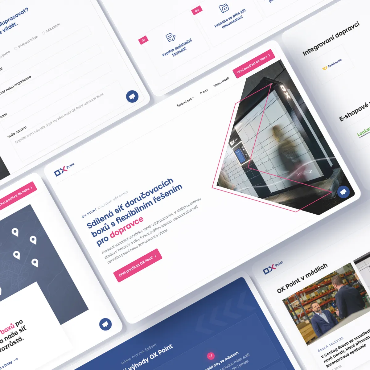
In the first place, the website serves as one of the main B2B touchpoints. We chose Webflow for its development, which helped us find a happy medium between performance, accessibility and visual appeal.
In addition to photography, tailored to each page by our colleagues at VNV Productions, we brought the site to life with interactive animations.
We set up the CMS to make long-term management as easy as possible for the client. Partner logos or frequently asked questions are automatically distributed among the individual subpages based on tags.
"My first experience with the Semibold team was on the OX Point project, where we prepared the website for a new product together. The collaboration was fluid, full of ideas down to the smallest details. Thanks to the complexity of the Near & Dear group, we also had the opportunity to work together on brand identity and PR, so for me it was an ideal collaboration."