Výluka is a non-profit organisation that helps trainee teachers. Its name (which in Czech almost sounds like Výuka, 'Teaching', but it means 'Exclusion') originated in weekly workshops in excluded localities, where those interested could try teaching.
Over the years, other projects have been included among the organisation's many activities, and it has finally outgrown its original brand. The Výluka team decided to communicate individual projects under their own names and asked us to set a visual style for the new brand system.
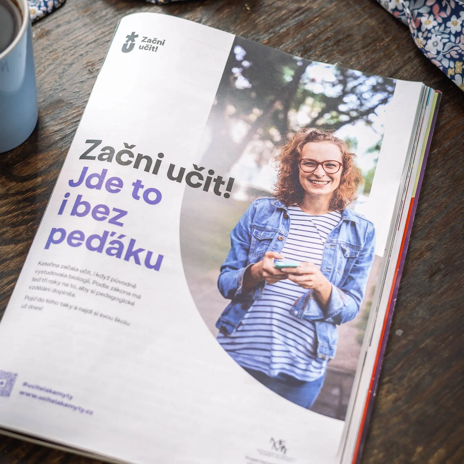
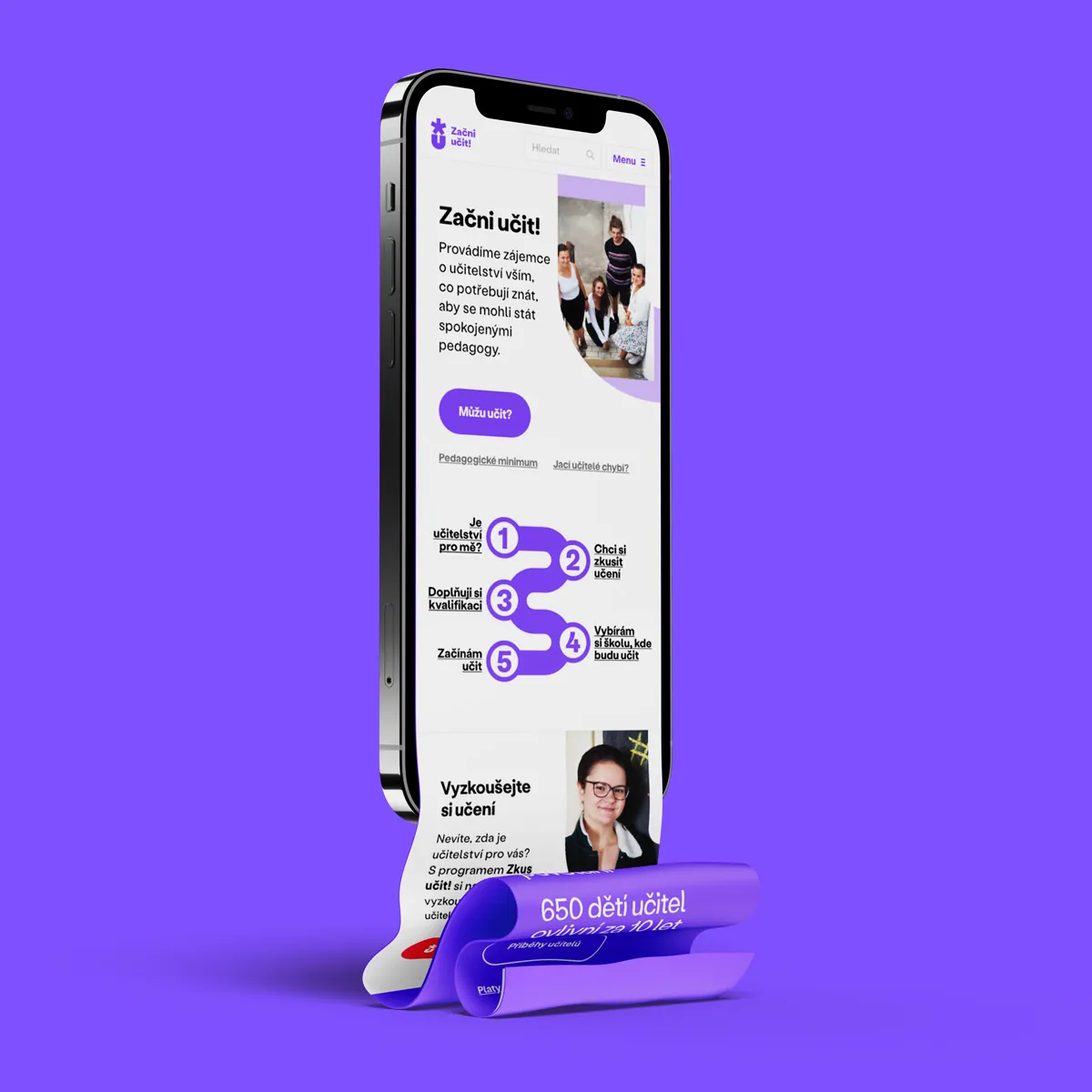
One of the motivations for rebranding was the development of the Začniučit.cz portal (StartTeaching.cz). It was created in cooperation with Česko.Digital and it functions as a signpost between the individual ways in which Výluka helps those interested in teaching.
The appeal 'Start teaching!' also became the basis for naming all the activities of the organization.
We worked on the assumption that, in the future, more projects will be added to the current 'Start teaching!', 'Try teaching!' and 'Get training!' projects. That's why we agreed that we need to design a strong symbol that interconnects the brand system.
The main challenge was to find the right degree of abstraction. We wanted to avoid visual clichés (such as the motif of a book) which, in the case of teaching, often connotes swotting up rather than the development of intellect. Finally, in the logo, we combined the star (as a symbol of beginning) with 'U' – the first letter of the word učit ('teach'), which is the basis of the names of all the projects. An arrow that appears in the space between them symbolizes the path that new teachers can be guided on.

Our common goal was to set up a visual language that, with its playfulness, builds on the tonality of Výluka but, at the same time, will be mature enough to stand alongside important partners.
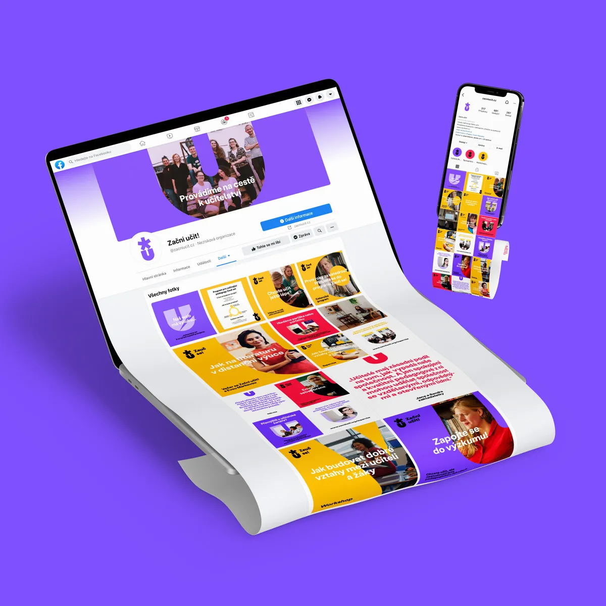
We connected the communication of all projects with photo masking and Stabil Grotesk from KOMETA Typefaces. To differentiate the individual brands, we used a color palette which we immediately prepared for future expansion.
As part of the design, we devoted a lot of energy to social networks, which are the main communication channel. By designing a large number of templates, we provided the Výluka team with a foundation to easily work with the visual style, but we also made sure to leave enough space for creative outputs.
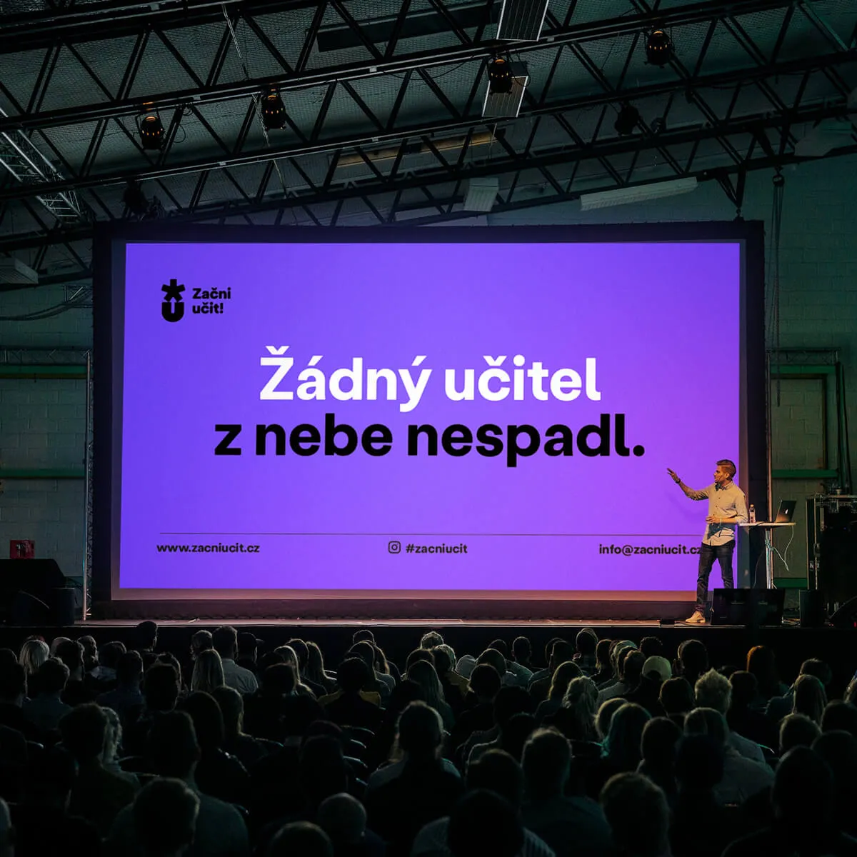
We are sure that making the path to education clearer and easier will bear fruit – shortly after its launch, the 'Start teaching!' project fell under the auspices of the Czech Ministry of Education. The project was featured in the non-profit category of Best Design Awards and World Brand Design Society.
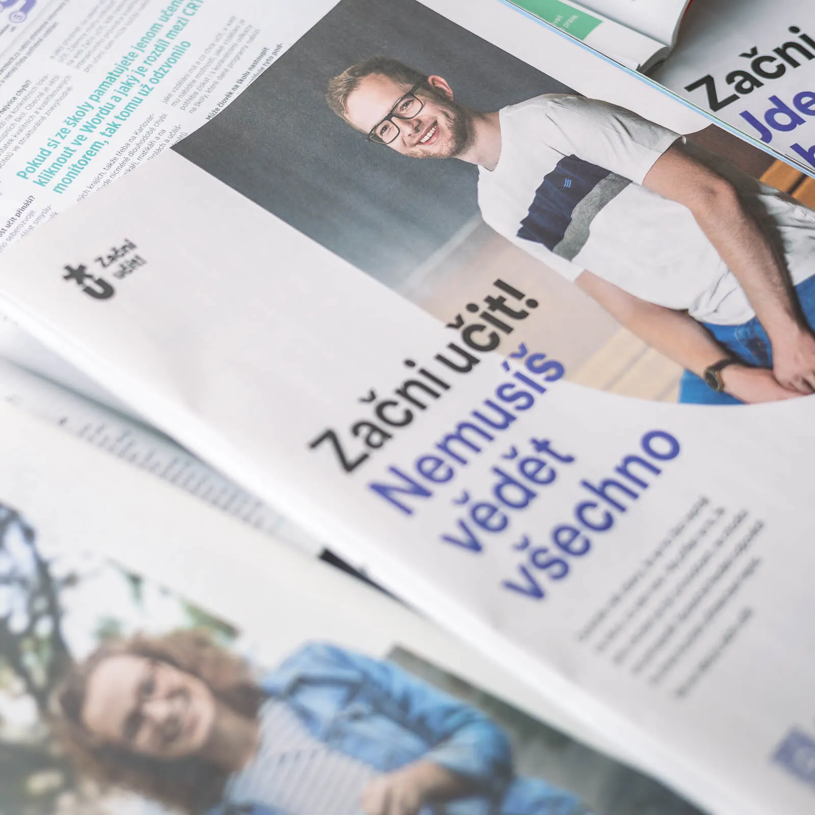
Building upon the visual identity, we worked on a campaign with the aim of dispelling stereotypes about teaching and inspiring individuals to pursue a career in education, not only those with formal pedagogical training but also those with practical experience in other fields.
We were presented with a selection of photos and stories from seven real teachers who had successfully challenged myths about teaching.
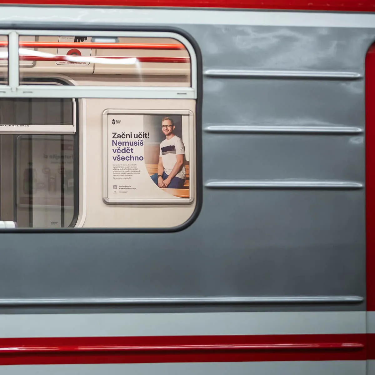
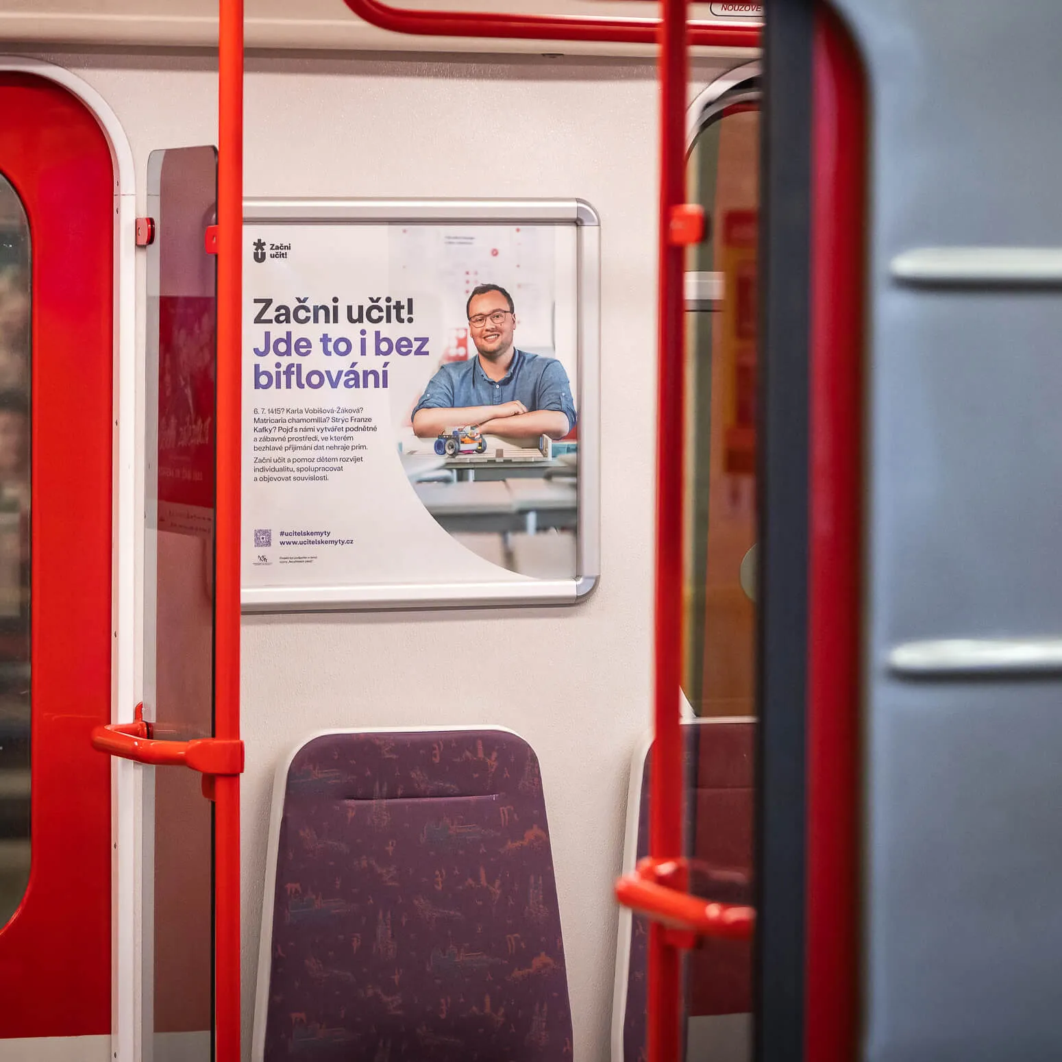
In addition to designing materials for print and social media, our task was to unify these stories in a verbal context. To fully harness the campaign's potential and enhance brand awareness, we devised a system that fully leverages the imperative potential in the organization's name, incorporating it into all headlines.
Our work could be seen in Prague metro carriages in the autumn of 2023. Simultaneously, it featured in publications such as Respekt, Reflex, and Deník.