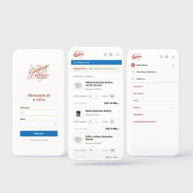
Mobile-first
Mobile-first is an approach to website design and development in which the interface is designed for mobile devices first and only then expanded to larger screens such as tablets and desktops. Unlike traditional responsive design, which scales a desktop version down to mobile, mobile-first starts with the smallest screen and progressively adds elements. The result is a cleaner, faster, and more user-friendly website.
Mobile devices dominate web traffic today, and a mobile-first approach reflects that reality from the very first design:
- Mobile accounts for most traffic: according to StatCounter, mobile devices account for approximately 62% of global web traffic (based on more than 5 billion page views a month, Q4 2024). Desktop holds roughly 36% (StatCounter Global Stats)
- Google indexes only the mobile version: as of July 2024, Google has completed its switch to mobile-first indexing—all websites are now crawled and indexed exclusively by the Googlebot smartphone crawler. Websites that are inaccessible on mobile devices are dropping out of the index (Google Search Central Blog, June 2024)
- Mobile conversions lag behind desktop: in its benchmark based on 90 billion user sessions, Contentsquare found a mobile conversion rate of 2.03% versus 3.81% on desktop. The gap of almost 1.8 percentage points shows how much potential businesses lose to a poor mobile experience (Contentsquare Digital Experience Benchmarks, 2025)
- Mobile speed drives revenue: a Think with Google and Deloitte study analyzing 30 million mobile sessions across 37 brands showed that improving load time by just 0.1 seconds increases conversions by 8.4% in retail and 10.1% in travel (Think with Google / Deloitte – Milliseconds Make Millions)
- Mobile commerce is growing: m-commerce accounts for an estimated 44% of all e-commerce sales in the US and tops $2.5 trillion worldwide in 2025. Poor mobile design directly affects revenue (Statista, 2025)
FAQ
What is the difference between mobile-first and responsive design?
Responsive design makes sure a website adapts to different screen sizes—but it typically starts from the desktop version and scales it down. Mobile-first is a strategy that starts with designing for the smallest screen and progressively adds elements for larger devices. A website designed mobile-first is always responsive, but a responsive website isn’t necessarily designed mobile-first. Since Google has indexed only the mobile version of websites since July 2024, a mobile-first approach is practically a must today.
Why does mobile have a lower conversion rate than desktop?
According to Contentsquare (90 billion sessions, 2025), mobile converts at 2.03% versus 3.81% on desktop. The main reasons are smaller screens that make navigation harder, slower loading on mobile networks, and more cumbersome form filling. A mobile-first approach addresses these issues by designing the interface around the constraints of mobile devices from the start—simpler navigation, fewer form fields, and optimized images for faster loading.
Is mobile-first worth it for B2B websites too?
Yes. Even though B2B websites tend to have a higher share of desktop traffic, Google indexes the mobile version without exception. On top of that, the Deloitte and Google study (30 million sessions) showed that even in lead generation, improving mobile speed by 0.1 seconds has a positive effect on conversions. A high-quality mobile experience is now the foundation for every type of website.
Sources:
- StatCounter Global Stats – Desktop vs Mobile Market Share – ongoing analysis of 5+ billion page views a month
- Google Search Central Blog – Mobile-First Indexing (2024) – official announcement that the switch to mobile-first indexing is complete
- Contentsquare – Digital Experience Benchmarks (2025) – analysis of 90 billion user sessions, conversion rates by device
- Think with Google / Deloitte – Milliseconds Make Millions – study of 30 million mobile sessions across 37 brands, impact of speed on conversions
- Statista – U.S. M-Commerce Share (2025) – mobile commerce’s share of total e-commerce sales