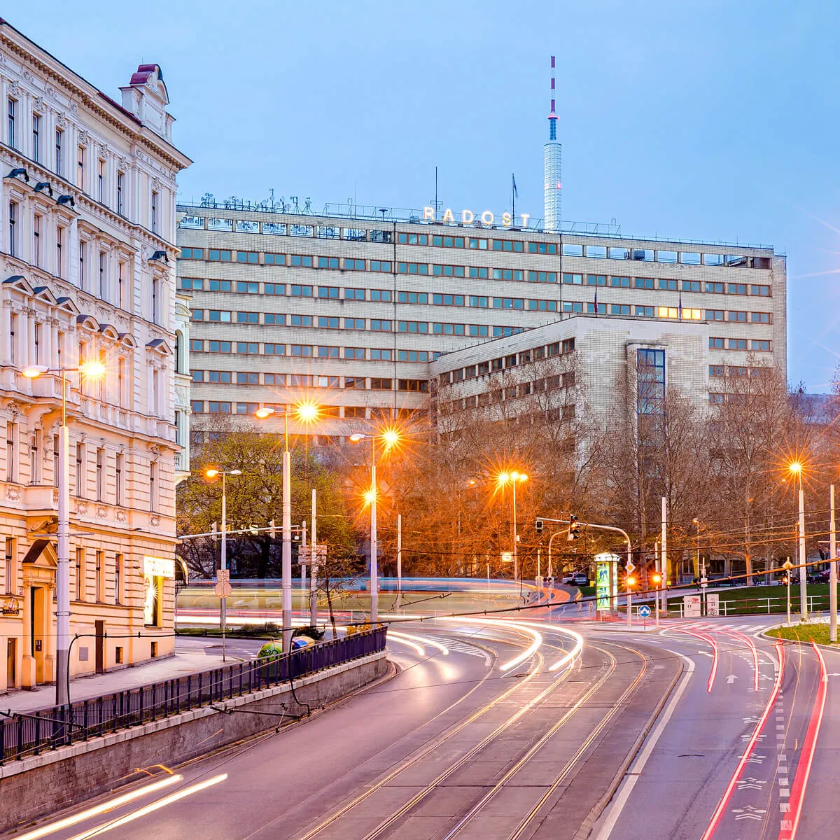
The very first skyscraper in Prague was built in 1934 by Josef Havlíček and Karel Honzík as the seat of the General Pension Institute in the Žižkov area. At that time, the use of innovative technologies and a unique cross-section floor plan for the building received both local and international acclaim.
After the war, the building housed trade unions and, in 2019, reopened to the public under new owners.

On the list of 14 possible new names were, for example, Vertigo (emphasizing the height and dominant position of the building in the Žižkov area) or DOST (based on the acronym of the building's old name).
Investors eventually chose the name Radost, which contains the acronym but leaves the past decades far behind and refers more to the original interwar face of the building. At the same time, Radost (meaning Joy) optimistically highlighted the building's new beginnings.
The legacy of functionalism, which carries a unique quality of architecture, and great ambitions for the coming years have become the main pillars of communication. Introductory campaigns worked with the slogan "To je Radost" (That's Joy!).

We needed to fill the building with tenants as soon as possible so we started working on the visual style before the final approval of the name. At the same time, we had to keep in mind that the name could change in a few years as well as the appearance of the building or its surroundings.
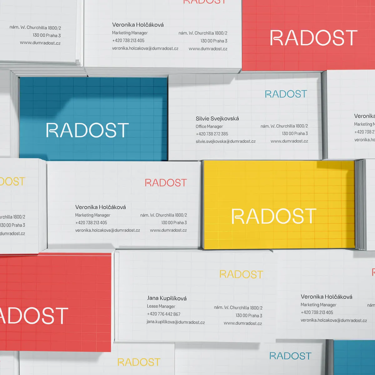
That's why we approached KOMETA Typefaces and built our visual identity on an original font, which is mainly inspired by the shapes of functionalist furniture. Thanks to that, communication holds together regardless of changing circumstances.
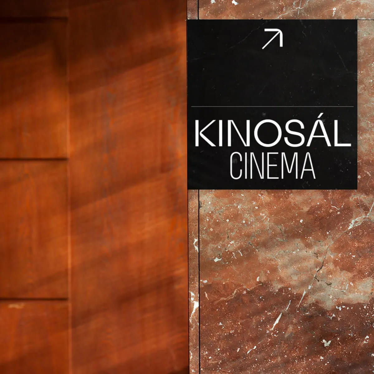
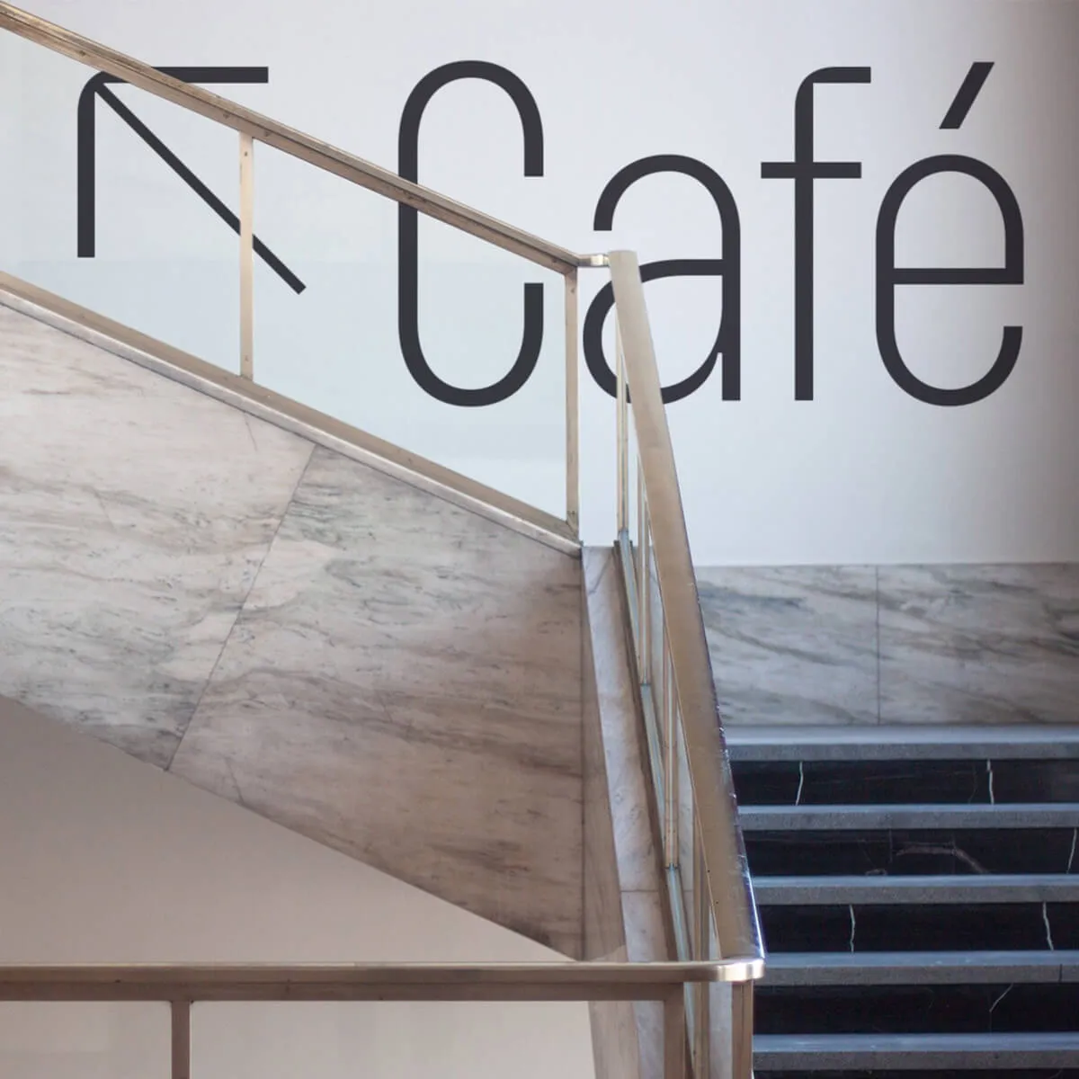
The main element of the building's identity has always been its tiled cladding. With reference to the interwar design, we used the grid formed by the tiles as a graphic element.
The big challenge was, as usual, the deadline – we had to manage the concept and implementation of the first outputs during the winter. Bare trees in the surrounding parks didn't make our task any easier and the building itself was visibly marked by its 90 years of use. As a solution, we chose three main variants of contrasting colour combinations and covered the photos with a duotone.
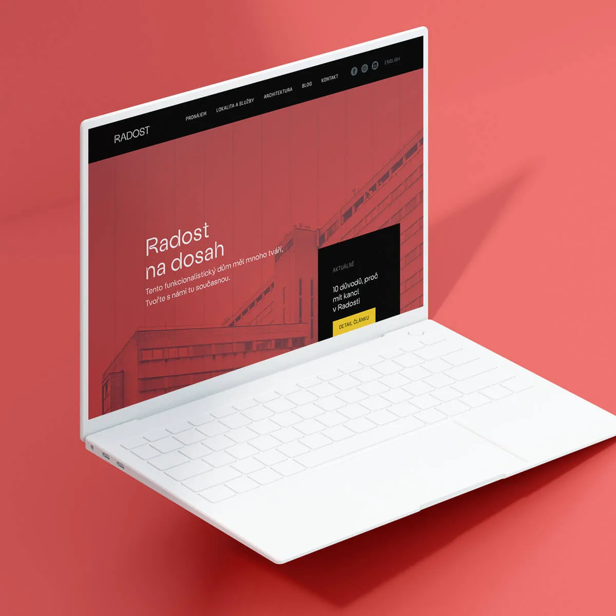
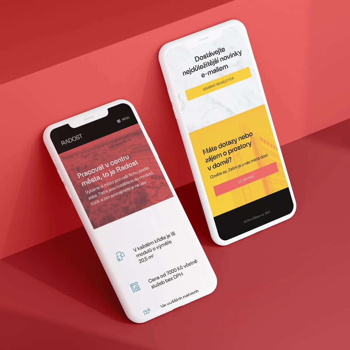
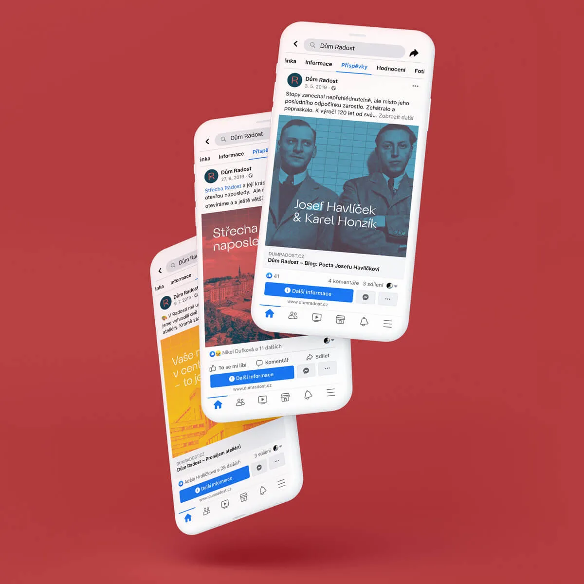
In the first phase, the website had primarily a commercial function but, at the same time, it displayed the history and future of the building. All digital campaigns led to the website so it had to be created in an extremely short time. Therefore, we built it on our favorite Webflow without the involvement of developers. In cooperation with Story TLRS and VNV Productions, we took care of all the initial content, including blog articles.
Naturally, in addition to the website, we also designed templates for social networks and created dozens of banners for performance campaigns.
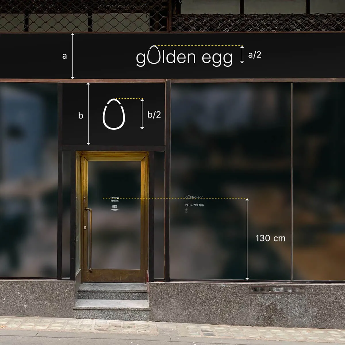
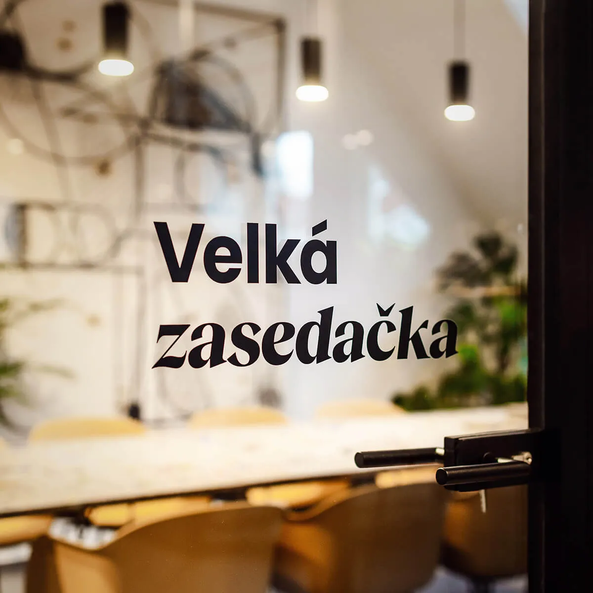
Radost House is full of offices, apartments and meeting rooms. However, in its northern wing, it also contains commercial premises leased as restaurants and shops. Unfortunately, the previous owner wasn't interested in their appearance at all, so they were visually incoherent. By creating a manual for shop windows, we've tried to contribute to the cultivation of public space.
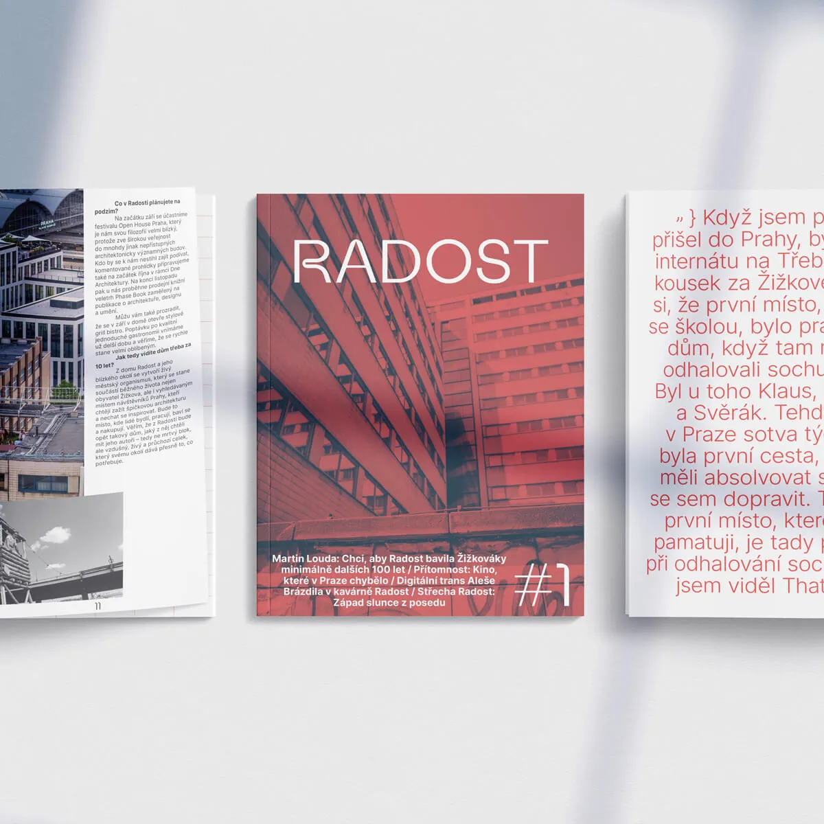
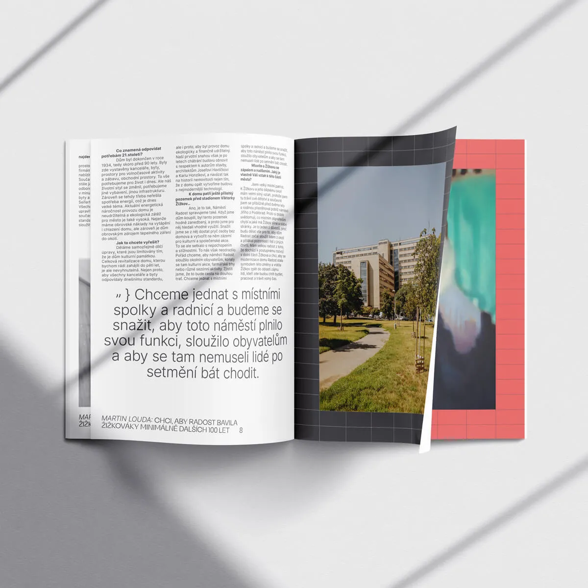
We also took on the design and production of a magazine, which the owners decided to publish as soon as they managed to fill Radost with culture.