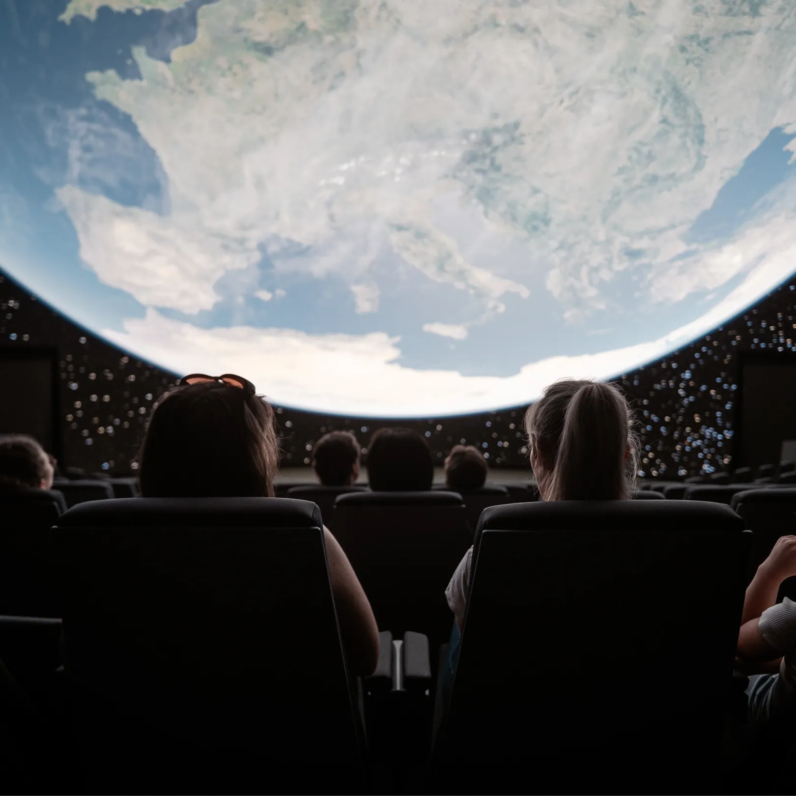
The Planetum brand covers three important astronomical institutions: the Prague Planetarium, Štefánik Observatory and Ďáblice Observatory.
Planetum asked us to help strengthen its visual identity, unify the communication of all three institutions, and make the visitor experience smoother – both online and on-site.
We kicked off the project with a workshop to align on goals and expectations. It quickly became clear that Planetum wasn't looking for a revolution, but an evolution – keeping the core elements of their identity while expanding them to better reflect the brand.
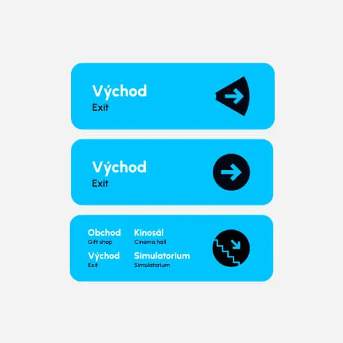
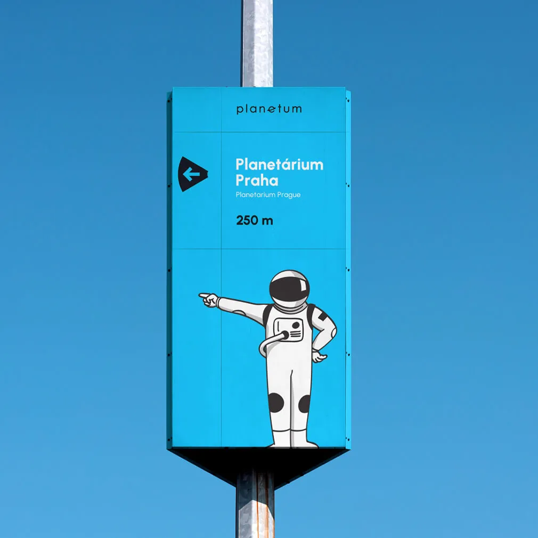
Together, we revised the existing elements of visual communication and mapped out how to unify, strengthen, and adapt them across all touchpoints – from online channels and printed materials to signage inside the buildings.
One of the key challenges was building a system that kept the visual identity consistent yet flexible – even in cases where Planetum had to work with visuals they couldn't alter.
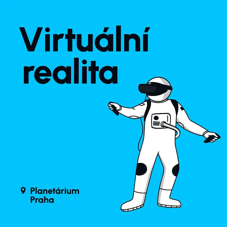
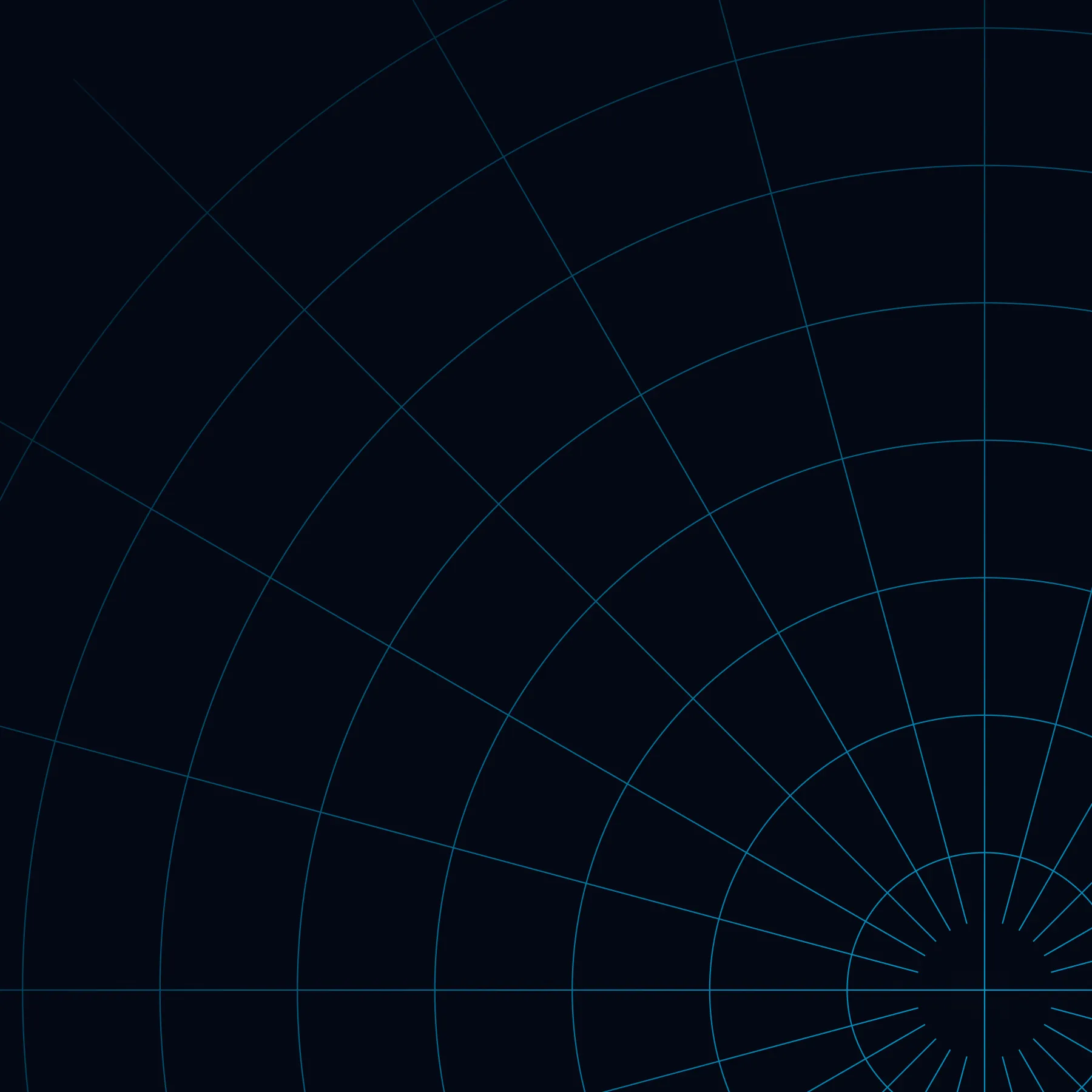
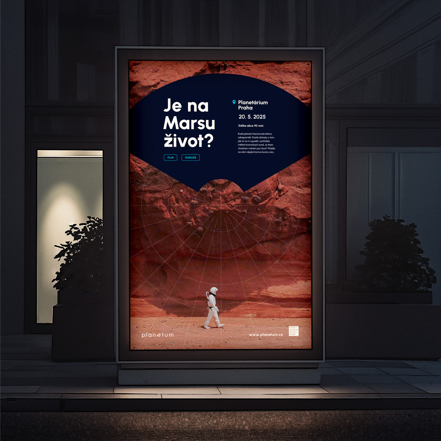
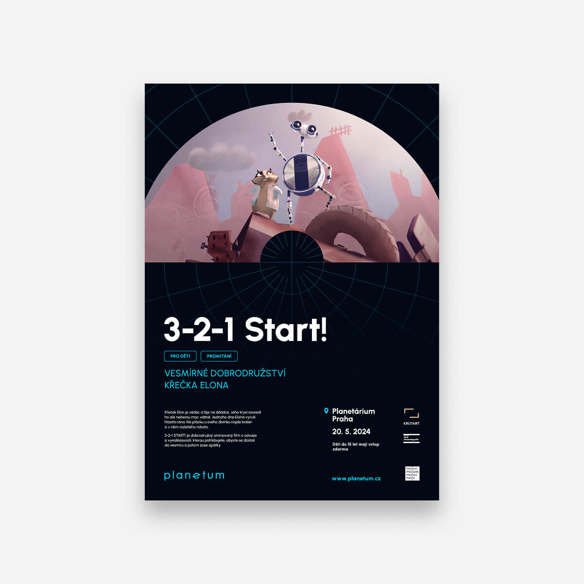
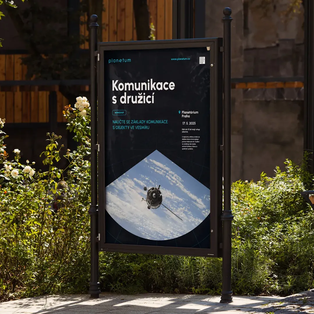
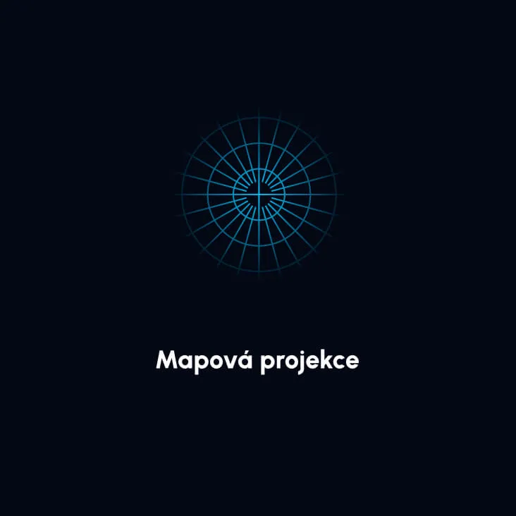
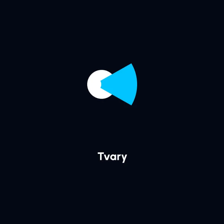
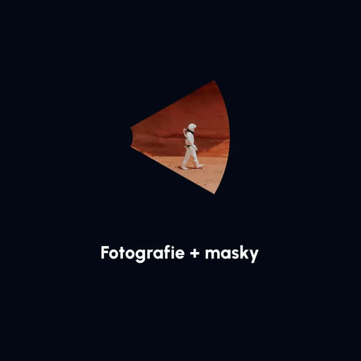
Our solution was a grid inspired by a map of the night sky. The grid divides photos, illustrations, and text into clear zones, making it easier to maintain a unified visual language across all materials.
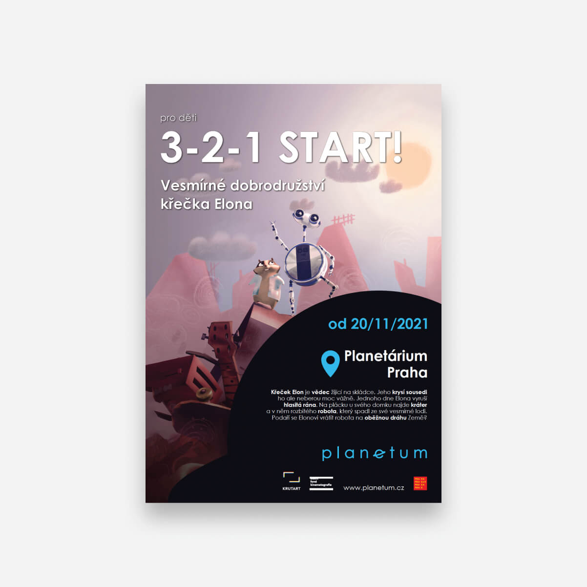
This system brought consistency to a wide range of outputs (posters, banners, websites) while still leaving room for variety.
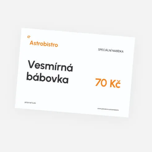
Another challenge was linking the main Planetum brand with its sub-brands, such as the observatories or the Astrobistro and Cosmocafé. We unified their communication by introducing a secondary logo placed above the first letter of each name.
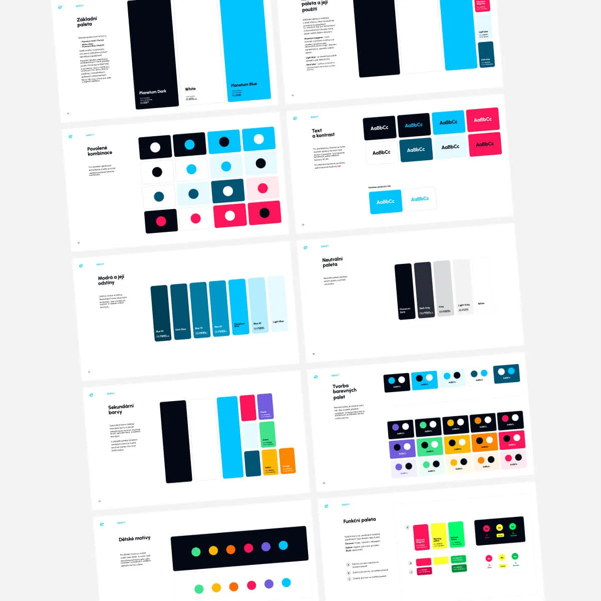
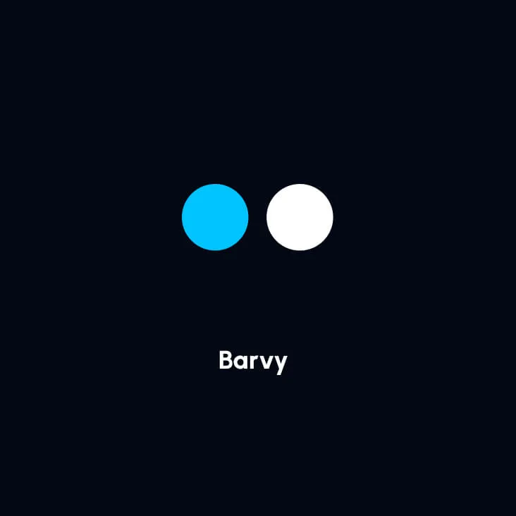
We expanded the color palette to ensure the shades work seamlessly together and provide enough contrast. The new palette was designed with readability and technical precision in mind, and it performs reliably across media – from print to digital – with clear guidelines for consistent application.


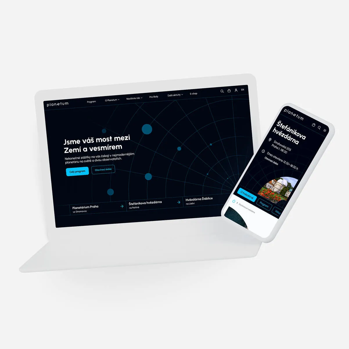
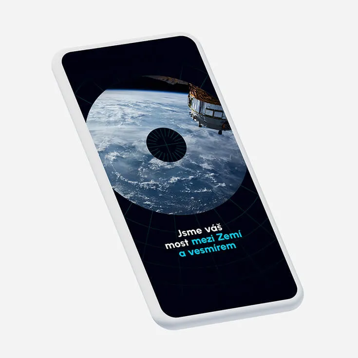
The redesign of Planetum's website was handled as a separate project: we focused on design, while Red Peppers took care of development.
We began with a UX design phase, meeting with the client several times to identify the main shortcomings of the old site. Alongside this, we prepared a competitive analysis – not only of Czech and international planetariums, but also of theaters, cinemas and other cultural institutions.
From there, we defined the main priorities and features, and divided the requirements into two categories: technical (site administration) and design-related (structure and user experience).
To bring clarity, we created a sitemap and wireframes for the most important pages, ensuring content was better connected and navigation more intuitive.
Since Planetum needed a modular website that could be easily custom edited, we designed a flexible system of blocks that can be moved, edited, or added – all while keeping the visual style consistent.
"Out of all the candidates, Semibold gave us the most confidence that they would be the right partner. Their concept was well thought out, the strategy was clear, and it was obvious they understood not only the assignment but also the brand itself – including its challenges and needs. From the very beginning, we didn’t see the cooperation as a one-off project, but as the start of a long-term partnership. We appreciated the smooth communication, strong project management, and the way the team handled more complex situations, such as the website brief or coordinating with a larger group of people. The result is a visual identity that truly works, and a brand book that we not only like, but also find genuinely useful."

Our collaboration with Planetum continues. We brought the Prague Planetarium logo to life through animation and created a set of presentation templates tailored for media, schools, and the general public.
We also designed a tram wrap that will ride through Prague from autumn 2025, showcasing the planetarium's new LED technology.
Looking ahead, our focus is on optimizing the visual language so that Planetum can maintain a consistently high standard across all outputs – even without our direct involvement.