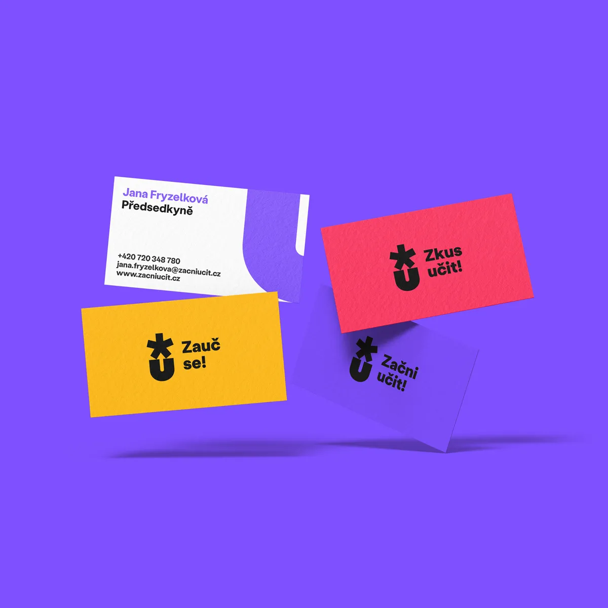
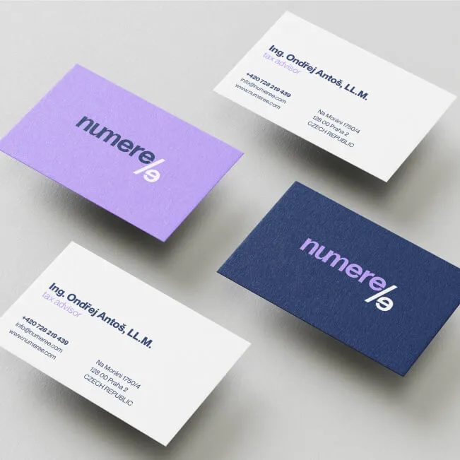
Color palette
A color palette is a defined set of colors that a brand uses consistently across all its communication channels. It includes primary, secondary, and accent colors and sets the rules for how they can be combined. A well-chosen color palette keeps a brand visually consistent and shapes how customers perceive and remember it.
Color isn't just an aesthetic choice—it's one of the most powerful tools a brand has to communicate its values and build recognition. Its influence on customer decisions is backed by research:
- People judge by color within seconds: a meta-analysis by Satyendra Singh of the University of Winnipeg (a review study published in Management Decision, 2006) concludes that people form a subconscious judgment about a product, person, or environment within 90 seconds – and that 62–90% of that assessment is based on color alone (Singh – Impact of Color on Marketing, Management Decision 2006)
- Color is a key factor in purchase decisions: a survey by the Secretariat of the Seoul International Color Expo (2004) found that 84.7% of respondents consider color the main factor when choosing a product—more than half of all the factors that influence a purchase (Seoul International Color Expo, 2004 – cited via COLORCOM)
- Consistent colors increase revenue: a Lucidpress/Marq report (a survey of 400+ organizations, updated in 2021) found that companies with a consistent brand presentation—including their color palette—see up to 33% higher revenue than companies with inconsistent branding (Lucidpress/Marq – State of Brand Consistency)
- Colors shape brand personality: a series of four experiments by Labrecque and Milne (Journal of the Academy of Marketing Science, 2012) showed that hue, saturation, and brightness directly influence which personality traits customers attribute to a brand—blue, for example, evokes competence and trustworthiness, while red suggests excitement and energy (Labrecque & Milne – Exciting Red and Competent Blue, JAMS 2012)
FAQ
How many colors should a brand color palette include?
A proven approach is to work with 5–8 colors: 1–2 primary colors (the brand's main identifier), 2–3 secondary colors (to round out the palette), and 1–2 accent colors (for CTAs and highlights). Research by Labrecque and Milne (a series of 4 studies, JAMS 2012) confirms that what matters isn't the number of colors but how well they work together and fit the brand's personality—the colors need to tell one consistent story.
How do you choose the right colors for a brand?
The choice should come from the brand's values and personality, not personal preference. Singh (2006) emphasizes that colors trigger emotional responses that vary across cultures. Blue is associated worldwide with trust and competence, which is why most financial institutions use it. Green evokes nature and sustainability. Red grabs attention and creates urgency. It's important to test colors with your target audience and check that they trigger the associations you intend.
Why isn't a single-color logo enough?
A single color doesn't give you enough flexibility for different situations—your website, social media, print materials, presentations. The Lucidpress/Marq report (400+ organizations, 2021) shows that even with brand guidelines in place, 69% of companies struggle with off-brand content. A defined palette with clear usage rules solves this and measurably strengthens brand recognition.
Sources:
- Singh – Impact of Color on Marketing (Management Decision, 2006) – a meta-analysis of color psychology in marketing, University of Winnipeg, cited 400+ times in academic literature
- Labrecque & Milne – Exciting Red and Competent Blue (JAMS, 2012) – a series of 4 experiments on how color affects perceived brand personality and purchase intent
- Lucidpress/Marq – State of Brand Consistency (2021) – a survey of 400+ organizations on how consistent branding affects revenue
- COLORCOM – Why Color Matters (Seoul International Color Expo, 2004) – a survey on how color influences consumer purchase decisions