The ČAST (Czech Table Tennis Association) oversees national teams, organizes competitions, and fosters youth activities.
Through our collaboration with TripleBang Agency, we crafted a modern visual identity for Czech table tennis, unifying all related brands under one recognizable sports style.
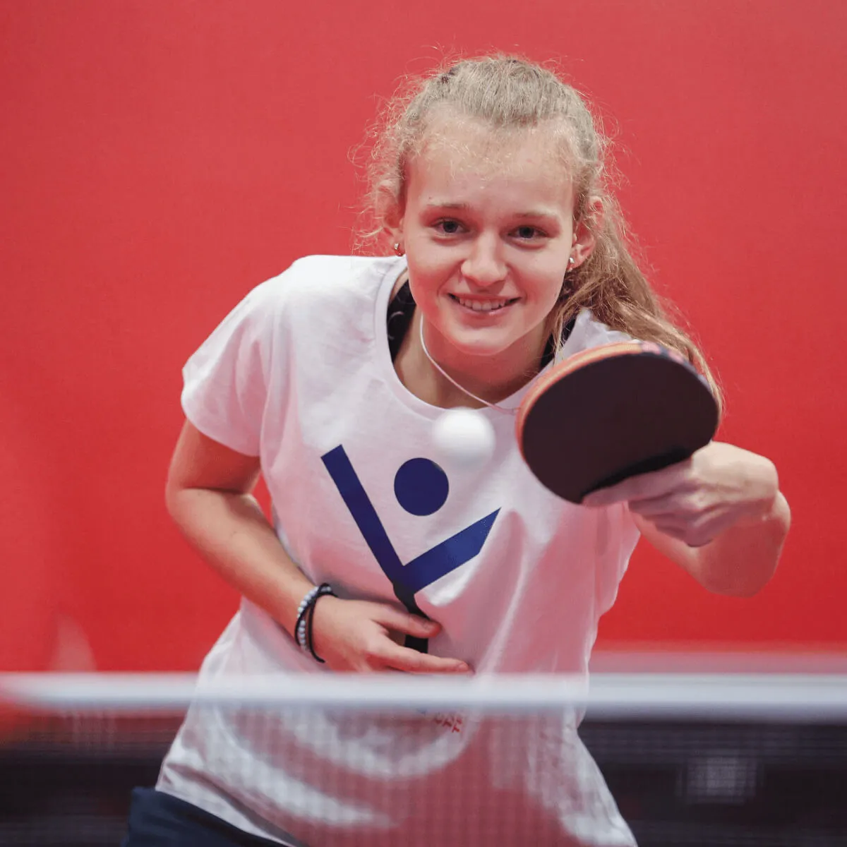

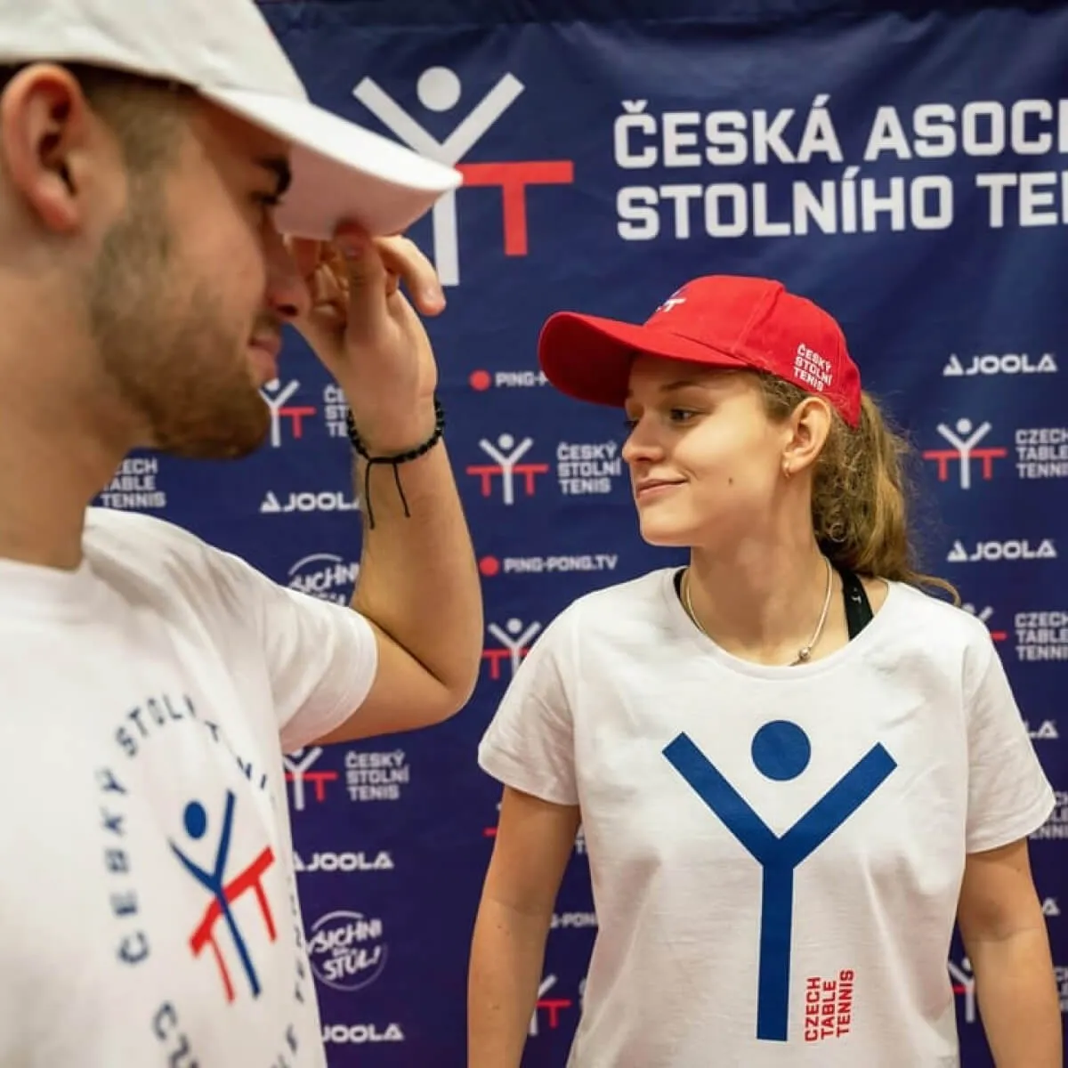
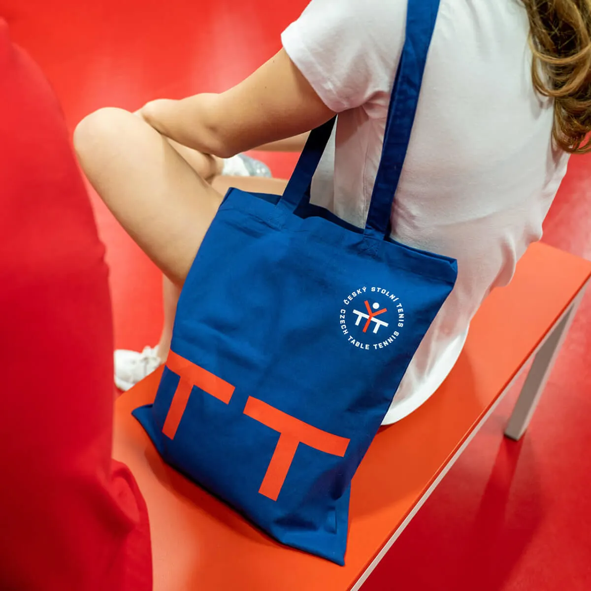
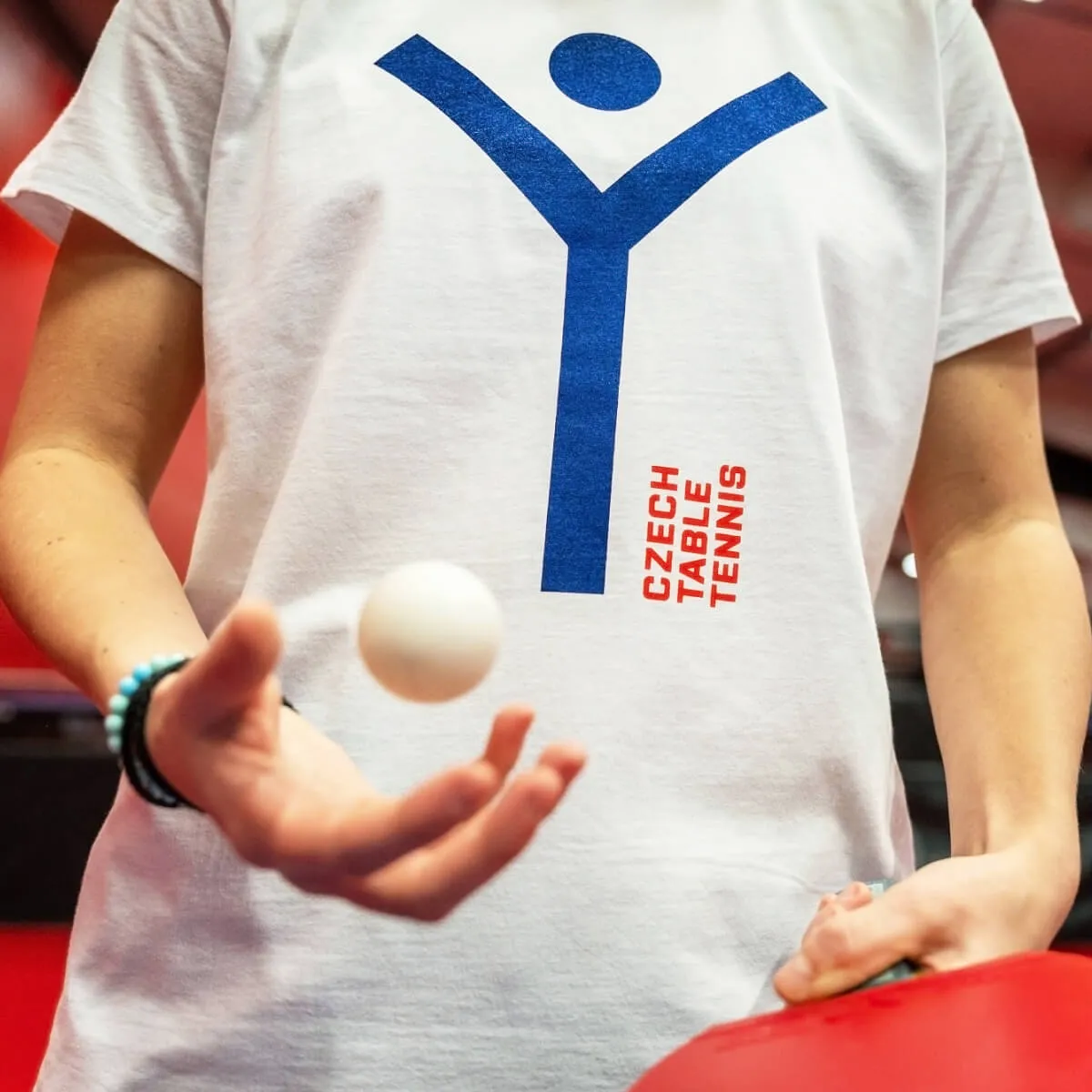
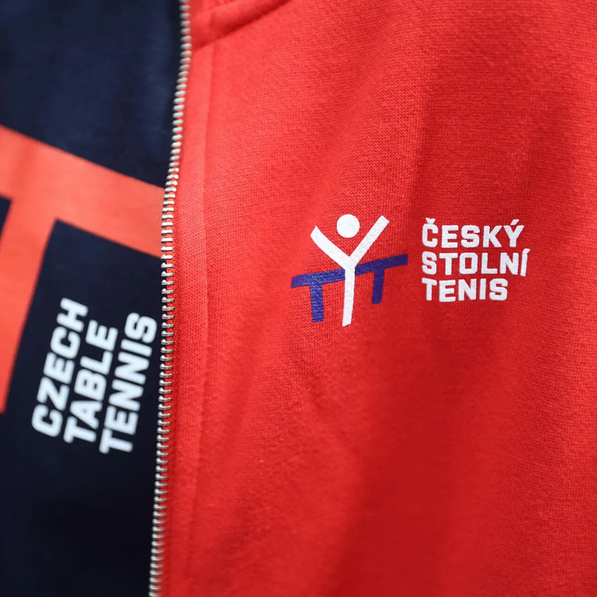
The new logo resembles a ping pong table with a victorious player standing beside it. Within the logo, you can also spot a pair of letter “T”s , representing Table Tennis, the inner contour of the Czech flag, and a ping pong ball.
We designed the logo in various versions for different outputs and brands affiliated with Czech table tennis – a basic circular form, another for the national team, and additional versions for online channels, among others.
The entire identity is infused with bold capital letters from the modern sans-serif font Purista by Tomáš Brousil.
You can now encounter the new identity at all events organized by ČAST and on the players' jerseys. It has been integrated into websites under the ČAST umbrella and can be found on all promotional materials.

We developed a website that, in an engaging manner, introduces the new identity to the public.
It explains the motivation behind the change, the creation of the logo and its various versions, the fonts used, and the color scheme.
It includes a frequently asked questions section and showcases application photos of the new identity.
In collaboration with VNV Productions, we created a video spot that breathes life into the new identity.
We also developed an audio jingle and branded animations that are now utilized by Pingcast and Ping-Pong TV.